# セマンティクス
# フォーム
フォームを作成するとき、以下の要素を使用することができます: <form> 、<label> 、<input> 、<textarea> 、そして <button> です。
ラベルは一般的にフォームの上部または左側に配置します。
<form action="/dataCollectionLocation" method="post" autocomplete="on">
  <div v-for="item in formItems" :key="item.id" class="form-item">
    <label :for="item.id">{{ item.label }}: </label>
    <input
      :type="item.type"
      :id="item.id"
      :name="item.id"
      v-model="item.value"
    />
  </div>
  <button type="submit">Submit</button>
</form>
2
3
4
5
6
7
8
9
10
11
12
どのように autocomplete='on' をフォーム要素上に含むことができるかに注目してください。そしてそれはフォーム内の全ての入力欄に適用されます。また各入力欄の autocomplete 属性に対して異なる値 (opens new window)をセットすることもできます。
# ラベル
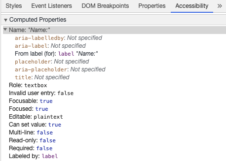
全てのフォームコントロールの目的を説明するためにラベルを提供してください。for と id はリンクしています:
<label for="name">Name</label>
<input type="text" name="name" id="name" v-model="name" />
2
chrome デベロッパツールでこの要素を検証し、Elements タブ内の Accessibility タブを開くと、どのように入力欄がその名前をラベルから取得するかを確認できます:
Warning:
以下のように入力欄をラップしているラベルを見たことがあるかもしれません:
<label>
  Name:
  <input type="text" name="name" id="name" v-model="name" />
</label>
2
3
4
一致する id で明示的にラベルを設定することは支援技術によってより適切にサポートされます。
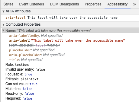
# aria-label
aria-label (opens new window) によりアクセス可能な名前を入力欄に付与することもできます。
<label for="name">Name</label>
<input
  type="text"
  name="name"
  id="name"
  v-model="name"
  :aria-label="nameLabel"
/>
2
3
4
5
6
7
8
この要素を Chrome DevTools で自由に検証し、どのようにアクセス可能な名前が変更されたか確認してください:
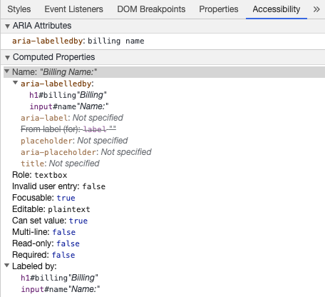
# aria-labelledby
aria-labelledby (opens new window) の使用法は、ラベルテキストが画面に表示されている場合に使用されることを除けば、aria-label に似ています。これは id によって他の要素とペアになっており、複数の id を関連付けることができます:
<form
  class="demo"
  action="/dataCollectionLocation"
  method="post"
  autocomplete="on"
>
  <h1 id="billing">Billing</h1>
  <div class="form-item">
    <label for="name">Name:</label>
    <input
      type="text"
      name="name"
      id="name"
      v-model="name"
      aria-labelledby="billing name"
    />
  </div>
  <button type="submit">Submit</button>
</form>
2
3
4
5
6
7
8
9
10
11
12
13
14
15
16
17
18
19
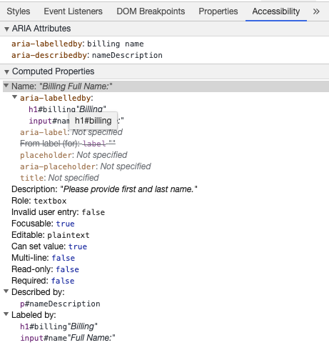
# aria-describedby
aria-describedby (opens new window) は、ユーザが必要とする可能性のある追加情報と説明を提供することを除けば、 aria-labelledby と同じ方法で使用されます。これは任意の入力欄の基準を説明するために使用することができます:
<form
  class="demo"
  action="/dataCollectionLocation"
  method="post"
  autocomplete="on"
>
  <h1 id="billing">Billing</h1>
  <div class="form-item">
    <label for="name">Full Name:</label>
    <input
      type="text"
      name="name"
      id="name"
      v-model="name"
      aria-labelledby="billing name"
      aria-describedby="nameDescription"
    />
    <p id="nameDescription">Please provide first and last name.</p>
  </div>
  <button type="submit">Submit</button>
</form>
2
3
4
5
6
7
8
9
10
11
12
13
14
15
16
17
18
19
20
21
Chrome DevTools で検出することで Description を確認することができます:
# プレースホルダ
多くのユーザが混乱する可能性があるため、プレースホルダの使用は避けてください。
プレースホルダによる問題の1つは初期状態で color contrast criteria (opens new window) を満たしていないことです。色のコントラストを修正するとプレースホルダが入力欄に事前入力されたデータのように見えます。以下の例を見ると、color contrast criteria を満たしている Last Name プレースホルダが事前入力されたデータのように見えることが確認できます:
ユーザがフォームを入力するために必要とするすべての情報を入力欄の外側で提供するのが最善です。
# 説明
入力欄に説明を追加するとき、入力欄に対して正しくリンクしていることを確認してください。
あなたは追加の説明を提供し、複数の id を aria-labelledby (opens new window) 内に束縛することができます。これにより、さらに柔軟な設計が可能になります。
<fieldset>
  <legend>Using aria-labelledby</legend>
  <label id="date-label" for="date">Current Date:</label>
  <input
    type="date"
    name="date"
    id="date"
    aria-labelledby="date-label date-instructions"
  />
  <p id="date-instructions">MM/DD/YYYY</p>
</fieldset>
2
3
4
5
6
7
8
9
10
11
あるいは、aria-describedby (opens new window) を使用して入力欄に説明を添付することもできます:
<fieldset>
  <legend>Using aria-describedby</legend>
  <label id="dob" for="dob">Date of Birth:</label>
  <input type="date" name="dob" id="dob" aria-describedby="dob-instructions" />
  <p id="dob-instructions">MM/DD/YYYY</p>
</fieldset>
2
3
4
5
6
# コンテンツの非表示
入力欄がアクセス可能な名前を持っている場合でも、視覚的にラベルを非表示にすることは非推奨です。しかし、入力欄の機能が周囲のコンテンツから理解できる場合は、視覚的なラベルを非表示にすることができます。
以下の検索フィールドを見てみましょう:
<form role="search">
  <label for="search" class="hidden-visually">Search: </label>
  <input type="text" name="search" id="search" v-model="search" />
  <button type="submit">Search</button>
</form>
2
3
4
5
これができるのは、検索ボタンが視覚的にユーザが入力欄の目的を特定を助けるためです。
CSS を使用して要素を視覚的に非表示にすることができますが、それらを支援技術で利用できるようにしておきます:
.hidden-visually {
  position: absolute;
  overflow: hidden;
  white-space: nowrap;
  margin: 0;
  padding: 0;
  height: 1px;
  width: 1px;
  clip: rect(0 0 0 0);
  clip-path: inset(100%);
}
2
3
4
5
6
7
8
9
10
11
# aria-hidden="true"
aria-hidden="true" を追加すると要素は支援技術から隠されますが、他のユーザから視覚的に利用可能になります。フォーカス可能な要素や、純粋に装飾的なコンテンツ、複製されたコンテンツ、または画面外のコンテンツには使用しないでください。
<p>This is not hidden from screen readers.</p>
<p aria-hidden="true">This is hidden from screen readers.</p>
2
# ボタン
フォーム内でボタンを使用するときは、フォームの送信をしないようにタイプを設定する必要があります。 入力欄を使用してボタンを作ることもできます:
<form action="/dataCollectionLocation" method="post" autocomplete="on">
  <!-- Buttons -->
  <button type="button">Cancel</button>
  <button type="submit">Submit</button>

  <!-- Input buttons -->
  <input type="button" value="Cancel" />
  <input type="submit" value="Submit" />
</form>
2
3
4
5
6
7
8
9
# 機能的な画像
機能的な画像を作るために次の技術を使うことができます。
入力欄
- これらの画像はフォーム上の送信タイプのボタンとして機能します
<form role="search">
  <label for="search" class="hidden-visually">Search: </label>
  <input type="text" name="search" id="search" v-model="search" />
  <input
    type="image"
    class="btnImg"
    src="https://img.icons8.com/search"
    alt="Search"
  />
</form>
1
2
3
4
5
6
7
8
9
10アイコン
<form role="search">
  <label for="searchIcon" class="hidden-visually">Search: </label>
  <input type="text" name="searchIcon" id="searchIcon" v-model="searchIcon" />
  <button type="submit">
    <i class="fas fa-search" aria-hidden="true"></i>
    <span class="hidden-visually">Search</span>
  </button>
</form>
2
3
4
5
6
7
8